June 4, 2014
Designers react to the new Penguin Random House logo
by Claire Kelley

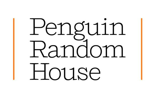
Pentagram, the esteemed design firm, has created a new logo for book publishing conglomerate Penguin Random House, which now consists of 250 independent imprints after the merger that was finalized last year. Pentagram partner Michael Bierut admitted that the interim logo—the juxtaposition of a penguin next to a house—was not popular. “Instead of satisfying to both sides,” Bierut told Bloomberg Businessweek, “we found it to be insulting to both sides.”
The new solution seems to be more popular. Penguin Random House has posted a video that shows the wordmark next to each of various imprints. The stacked three word solution was purposely developed to work next a range of symbols, and each imprint’s unique identity will still appear on the spines of books. The Bloomberg Businessweek article also reveals more details about the type choice:
The choice of typeface, called Shift, subtly refers to the publisher’s business as a merchant of words: Jeremy Mickel conceived it as a successor to Courier, which mimics the output of an old-timey typewriter. As a serif typeface, it exudes a warmth that belies Penguin Random House’s corporate magnitude.
Design Week quotes Bierut as saying “we needed a typeface that was neutral enough to work with all of the very different imprint symbols. Yet we didn’t want a cold sans serif, but rather something that had a bit of literary quality.”
I asked designers for their reactions to the new Penguin Random House identity, and some responses are collected below:
“I find the new design system quite refreshing. It’s nice to see a purely typographic solution to the complex problem of dealing with the merger of two very memorable and strong visual brands. The Penguin and Random House logos are very recognizable by the book-buying audience and combining them together through the use of text rather than an image seems perfectly appropriate—it is about the ‘written word’ after all.The chosen typeface, (Jeremy Mickel’s Shift), works quite well here. Rather than to try to merge the intrinsically British qualities of Penguin with the American sensibilities of Random House, it goes for a simpler metaphor, that of the typewriter. This again seems like a wise choice. The typeface doesn’t feel stereotypically ‘typewritery’ as some typefaces can be, but is rather more subtle, classier, older. It feels more elegant due to its relative thinness and the details present in the letterforms. The typeface also reminds me of the American typefaces, and of Scotch Romans commonly used in book printing in the United States throughout the late 19th century. It feels familiar yet new at the same time—a good fit given the company involved.
I like that rather then wrestle with the enormous weight of the legacy and history of Jan Tschichold (designer of the most recognizable of the Penguin logos) and Rockwell Kent (designer of the original Random House logo), the new brand approach lets them simply stay. Sometimes it’s good to leave things as they are. Making something new doesn’t mean you have to get rid of the old. I think this adds a nice anchor to the imprint logos, and holds up well with the myriad of logos under their umbrella.”
—Alexander Tochilovsky, graphic designer, curator of the Herb Lubalin Study Center, adjunct professor at the Cooper Union, instructor in Type@Cooper
“Bierut’s solution—a ‘wordmark plus sub-brand’ system—does deal with the big challenges: the horde of imprints and the illustrious yet visually discordant logos. This system has to lean heavily on the typography, and Mickel’s warm, modern typeface pulls it off: evoking the typewriter’s ample serifs without going ‘full Courier.’ It’s a little risky for a behemoth to go with such a young typeface—if it ages poorly, it ages poorly on millions of printed objects—but more power to them.”
—Roque Strew, designer, Texas
“Pentagram’s typographic solution is a smart and sensible one. The dynamic logo unites the many publishing houses of Penguin Random House while displaying the company’s diversity. The logo must have satisfied the stakeholders, but my question—less as a designer and more as one of the thousands of dedicated fans of the Penguin logo— is, of course, ‘Have we lost our dear penguin?'”
—Haruka Aoki, designer, New York (note: the penguin will still appear on the spines of Penguin imprint books, and it also appears to the left of the wordmark in the UK logo)
“A purely typographic solution was the way to go, I believe. Nice choice of typeface too. The endorsement lock-up could’ve felt much more forced and corporate but is rather subtle. I think it’s a well thought-out mark.”
—Bumhan Yu, designer, New York
“I think Pentagram did the best they could with a challenging brief. They were asked to design a logo for a mammoth company that is composed of hundreds of smaller imprints, each of which has its own existing logo, style, and market. The typewriter-inspired slab serif they chose has enough personality to create a recognizable feeling but not so much that it will draw attention away from the graphic logos. It’s fairly readable at smaller sizes, but I doubt very much that you’ll be seeing this new logo on book spines. This is a logo for letterheads and perhaps title pages.”
—Joshua J. Friedman, writer and former art director for Boston Review Books
Claire Kelley is the Director of Library and Academic Marketing at Melville House.