June 15, 2015
Hail & Farewell: Paul Bacon, legendary book designer and creator of the “Big Book Look”
by Mark Krotov

“If I was born to do something, it was to design book jackets.”
The book designer Paul Bacon died last week in Fishkill, NY. He was ninety-one years old.
Though Bacon illustrated a number of beautiful jazz album covers, he was better known for his book covers, which he created from the 1950 (his first commission was a book he also illustrated: Bill Westley’s Chimp On My Shoulder) through his retirement around 2000. (He continued to freelance until 2013.) According to his own estimates, Bacon designed about 6,500 of them.
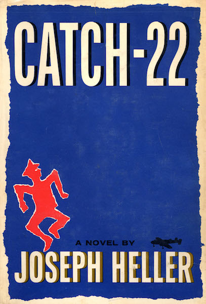
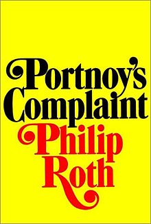
Bacon was responsible for some of the most famous covers of the American midcentury, including Joseph Heller’s Catch-22, Philip Roth’s Portnoy’s Complaint, and Robert Caro’s The Power Broker.
Most of the pieces about Bacon published since his death last Monday have referred to something called the “Big Book Look.” Steven Heller’s 2002 piece in Print Magazine offers an excellent description of that look—along with the Bacon-designed cover that inaugurated it:
While each of [Bacon’s] covers was distinctively designed, they all exhibited traits in common, which in the 1960s fused into something known as the “Big Book Look”: large, bold title, prominent author’s name, small conceptual image.
The “Look” had its inception in 1956 when Bacon was commissioned by Simon & Schuster’s art director, Tom Bevans, to design the jacket for Meyer Levin’s Compulsion, a roman à clef about two young men who systematically plan and carry out the cold-blooded murder of a younger boy to see if they can get away with the crime. The publisher knew that the highly-publicized real-life killing of Bobby Franks by Nathan Leopold and Richard Leopold would popularize the novel, but was uncertain how to devise a jacket that would be suggestive without being lewd and evoke a sense of mystery without resorting to clichés. Bacon sketched out a number of ideas until he came up with the rough, hand-scrawled word “Compulsion” which he positioned at the top of the jacket, taking up a fourth of the space, while below it, an empty taupe rectangle bled off the field, and below that, at the bottom, was scrawled “a novel by Meyer Levin” Sparse and dramatic—yet Bacon felt something was missing.
That “something” became two small, nervously drawn figures in red, running on the vacant expanse upward toward the title. Although the cover recalls to mind Saul Bass’s 1955 expressionistic film poster for The Man with the Golden Arm, it was more likely influenced by the jazz albums Bacon had designed starting in the late 1940s. Whatever the influences, the book became a huge bestseller and the jacket, displayed everywhere, caught the publishing industry’s attention.
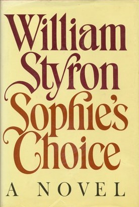
The “Big Book Look” seems like an intuitive category, but very little unites, say, Bacon’s aggressive and straightforward design for William Styron’s Sophie’s Choice and the jumpy, twitchy, paranoid masterpiece that is Compulsion—other than their designer. That said, Peter Mendelsund, Knopf associate art director, book designer, commentator, and all around brilliant person, told ThinkProgress that the “Big Book Look” was about emphasis:
Paul’s work brought into high relief that what we do is create hierarchy. When people talk about the Big Book Look, what they really mean is one element on the jacket is being foregrounded, is really large, and is crying out for your attention.
Still, the more I read about Bacon, it’s hard not to feel that in his case, the “Big Book Look” must also be a kind of shorthand for the work of a designer who was remarkably adept at meeting the demands of the publishing house, the author, the project, and the time. Unlike another enormously talented book designer named Paul—Paul Rand—whose treatments of H.L. Mencken, Jean-Paul Sartre, and Henry James are almost shockingly consistent, Bacon seemed to possess an adaptability that bordered on the radical.
Ned Drew and Paul Sternberger made a similar point in their terrific book By Its Cover: Modern American Book Cover Design:
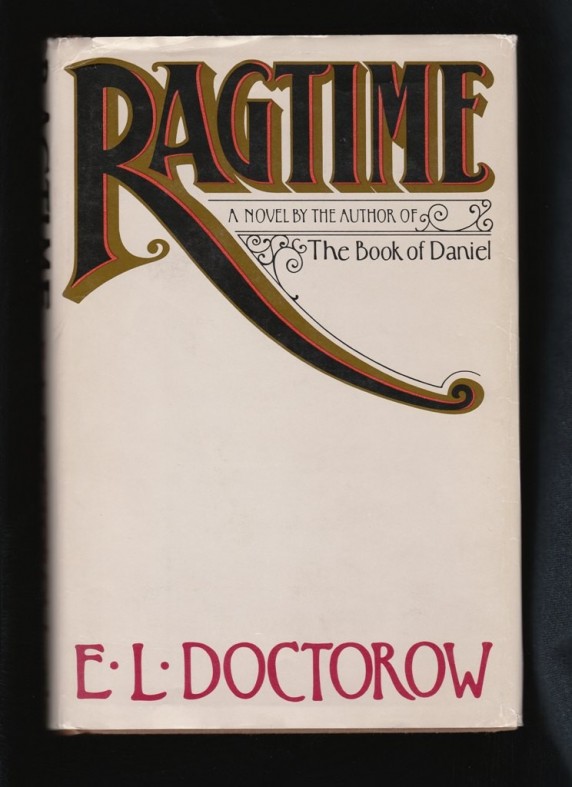
While observers like [Hank] O’Neil and Steven Heller applauded Bacon’s “big book look,” in truth that look describes only part of the designer’s oeuvre. Considering covers like Saint Jack in comparison with The Most of S.J. Perelman or Ragtime, it becomes clear that Bacon had the capability to generate designs in a vast spectrum of styles.
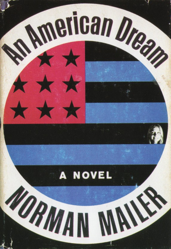
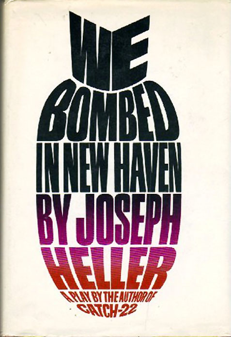
Below is a selection of covers that offers not much more than a hint of Bacon’s amazing range.

Mark Krotov is senior editor at Melville House.