June 6, 2014
The logos behind the Penguin Random House logo
by Christopher King
With the unveiling of the new Penguin Random House logo this week, designers everywhere breathed a sigh of relief—we wouldn’t be subjected to a penguin stepping out of a door (an actual proposal) or on a house (not an actual proposal). If the new wordmark feels slightly underwhelming and corporate-y, it’s only fitting for what is now the largest corporate conglomerate in publishing history, and Jeremy Mickel’s Shift typeface packs a remarkable amount of character into such a small space.
As the dust settles, it’s worth revisiting the history of the two brands that make up the new Penguin Random House, both of which are among the most successful branding projects of the twentieth century, and with some of the most legendary designers behind them.
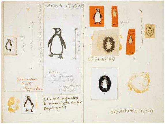
In a new book, TM: The Untold Stories Behind 29 Classic Logos, excerpted this week by Bloomberg Businessweek, Mark Sinclair recounts the story behind the iconic Penguin logo. Originally designed by a 21-year-old Edward Young in 1935, different variations proliferated until the branding was standardized and codified by Jan Tschichold:
In 1946, Tschichold arrived at Penguin and during his time there cemented the positioning of the author’s name and title on the cover, cleaned up both spine and back cover layouts, and refined Young’s logo (of which there were now several variants), creating eight versions. All this was eventually enshrined in the designer’s ‘composition rules’, which attempted to give Penguin’s printers and typographers a unified approach.
In 2003, Pentagram’s Angus Hyland subtly revised Tschichold’s penguin, making it slightly thinner and creating new guidelines for use in an ever-increasing array of international formats and media. (Hyland’s partner, Michael Bierut, led the design of the new Penguin Random House logo.)
Across the Atlantic in New York, the Random House logo dates back to 1928, when Bennett Cerf chose Candide as the first title for his new imprint. According to the former New York Public Library president and Voltaire scholar Paul LeClerc, the house began its life as an illustration by Rockwell Kent on the book’s colophon page, and is meant to be the house where Candide and his friends live at the book’s conclusion. Though it’s been simplified a bit to reproduce well at small sizes, the house has remained otherwise unchanged for nearly ninety years, and will continue to serve as the logo for the Random House imprint.
In the end, the new Penguin Random House logo is as much as anything a way to avoid interfering with these hallmarks of literary culture, and for that it should be celebrated.
Christopher King is the Art Director of Melville House.

